自定义组件,因为小程序是 MVVM 是数据驱动,所以,把所有的控制流程、动态流程的数据(即自变量)都交给组件的调用方,随着调用方 setData 使元数据改变来驱动控制流程、动态流程(因变量)的变化,如 Dialog的显示和隐藏是因变量,而控制 Dialog 的显示状态的量则是因变量。
类似于页面,一个自定义组件由json wxml wxss js 4个文件组成。
自定义组件
1、 json 文件配置
要编写一个自定义组件,首先需要在 json 文件中进行自定义组件声明:
{
  "component": true,
  "usingComponents": {} }
2、wxml 模板
还要在 wxml 文件中编写组件模版:
<view class='wx_dialog_container' hidden="{{!isShown}}"> <view class='wx-mask'></view> <view class='wx-dialog'> <view class='wx-dialog-title'>{{ title }}</view> <view class='wx-dialog-content'>{{ content }}</view> <view class='wx-dialog-footer'> <view class='wx-dialog-btn' catchtap='_cancelEvent'>{{ cancelText }}</view> <view class='wx-dialog-btn' catchtap='_confirmEvent'>{{ confirmText }}</view> </view> </view> </view>
-
1
-
2
-
3
-
4
-
5
-
6
-
7
-
8
-
9
-
10
-
11
-
12
3、wxss 样式
在 wxss 文件中加入组件样式:
.wx-mask { position: fixed; z-index: 1000; top: 0; right: 0; left: 0; bottom: 0; background: rgba(0, 0, 0, 0.3); } .wx-dialog { position: fixed; z-index: 5000; width: 80%; max-width: 600rpx; top: 50%; left: 50%; -webkit-transform: translate(-50%, -50%); transform: translate(-50%, -50%); background-color: #fff; text-align: center; border-radius: 3px; overflow: hidden; } .wx-dialog-title { font-size: 18px; padding: 15px 15px 5px; } .wx-dialog-content { padding: 15px 15px 5px; min-height: 40px; font-size: 16px; line-height: 1.3; word-wrap: break-word; word-break: break-all; color: #999; } .wx-dialog-footer { display: flex; align-items: center; position: relative; line-height: 45px; font-size: 17px; } .wx-dialog-footer::before { content: ''; position: absolute; left: 0; top: 0; right: 0; height: 1px; border-top: 1px solid #d5d5d6; color: #d5d5d6; -webkit-transform-origin: 0 0; transform-origin: 0 0; -webkit-transform: scaleY(0.5); transform: scaleY(0.5); } .wx-dialog-btn { display: block; -webkit-flex: 1; flex: 1; -webkit-tap-highlight-color: rgba(0, 0, 0, 0); position: relative; } .wx-dialog-footer .wx-dialog-btn:nth-of-type(1) { color: #353535; } .wx-dialog-footer .wx-dialog-btn:nth-of-type(2) { color: #3cc51f; } .wx-dialog-footer .wx-dialog-btn:nth-of-type(2):after { content: " "; position: absolute; left: 0; top: 0; width: 1px; bottom: 0; border-left: 1px solid #d5d5d6; color: #d5d5d6; -webkit-transform-origin: 0 0; transform-origin: 0 0; -webkit-transform: scaleX(0.5); transform: scaleX(0.5); }
-
1
-
2
-
3
-
4
-
5
-
6
-
7
-
8
-
9
-
10
-
11
-
12
-
13
-
14
-
15
-
16
-
17
-
18
-
19
-
20
-
21
-
22
-
23
-
24
-
25
-
26
-
27
-
28
-
29
-
30
-
31
-
32
-
33
-
34
-
35
-
36
-
37
-
38
-
39
-
40
-
41
-
42
-
43
-
44
-
45
-
46
-
47
-
48
-
49
-
50
-
51
-
52
-
53
-
54
-
55
-
56
-
57
-
58
-
59
-
60
-
61
-
62
-
63
-
64
-
65
-
66
-
67
-
68
-
69
-
70
-
71
-
72
-
73
-
74
-
75
-
76
-
77
-
78
-
79
-
80
-
81
-
82
-
83
-
84
-
85
-
86
-
87
-
88
-
89
-
90
-
91
-
92
-
93
-
94
-
95
-
96
4、js 控制
在自定义组件的js文件中,需要使用 Component() 来注册组件,并提供组件的属性定义、内部数据和自定义方法。组件的属性值和内部数据将被用于组件 wxml 的渲染,其中,属性值是可由组件外部传入的。
Component({
options: {
multipleSlots: true }, /**
* 组件的属性列表
*/ properties: { title: { type: String, value: '标题' }, content: { type: String,
value: '弹窗内容' }, cancelText: { type: String,
value: '取消' }, confirmText: { type: String,
value: '确定' }, isShown: { type: Boolean,
value: false }
}, /**
* 私有数据,组件的初始数据
* 组件的初始数据
*/ data: { }, /**
* 组件的方法列表
*
*/ methods: { _cancelEvent() { this.triggerEvent("cancelEvent")
},
_confirmEvent() { this.triggerEvent("confirmEvent"); }
}
})
-
1
-
2
-
3
-
4
-
5
-
6
-
7
-
8
-
9
-
10
-
11
-
12
-
13
-
14
-
15
-
16
-
17
-
18
-
19
-
20
-
21
-
22
-
23
-
24
-
25
-
26
-
27
-
28
-
29
-
30
-
31
-
32
-
33
-
34
-
35
-
36
-
37
-
38
-
39
-
40
-
41
-
42
-
43
-
44
-
45
-
46
-
47
-
48
-
49
-
50
-
51
-
52
-
53
-
54
-
55
-
56
-
57
-
58
-
59
-
60
-
61
-
62
-
63
-
64
-
65
-
66
-
67
调用
1、json文件配置
使用已注册的自定义组件前,首先要在页面的 json 文件中进行引用声明。此时需要提供每个自定义组件的标签名和对应的自定义组件文件路径:
"usingComponents": { "dialog": "../../../components/dialog/dialog" }
2、wxml 中引用
在页面的 wxml 中就可以像使用基础组件一样使用自定义组件。节点名即自定义组件的标签名,节点属性即传递给组件的属性值。
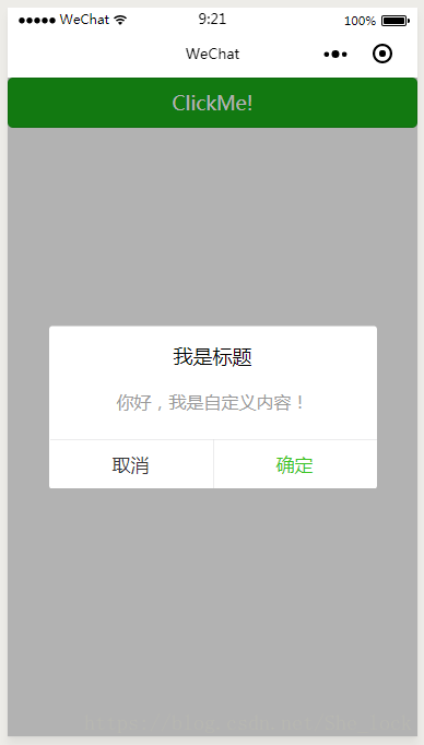
<dialog id='dialog' title='我是标题' content='你好,我是自定义内容!' cancelText='取消' confirm='确定' isShown="{{isShown}}" bind:cancelEvent="_cancelEvent" bind:confirmEvent="_confirmEvent"/>
3 、js控制
js 文件中需要声明Data,以及触发的函数。
data: {
isShown: false },
_cancelEvent(e) {
console.log('你点击了取消'); this.setData({
isShown: false })
},
_confirmEvent(e) {
console.log('你点击了确定'); this.setData({
isShown: false })
}
-
1
-
2
-
3
-
4
-
5
-
6
-
7
-
8
-
9
-
10
-
11
-
12
-
13
-
14
-
15
-
16
-
17
-
18
-
19
-
20
初始触发显示:
 <button type="primary" bindtap="showDialog"> ClickMe! </button>

    showDialog() {
        this.setData({
            isShown: true })
    }
效果
本站文章版权归原作者及原出处所有 。内容为作者个人观点, 并不代表本站赞同其观点和对其真实性负责,本站只提供参考并不构成任何投资及应用建议。本站是一个个人学习交流的平台,网站上部分文章为转载,并不用于任何商业目的,我们已经尽可能的对作者和来源进行了通告,但是能力有限或疏忽,造成漏登,请及时联系我们,我们将根据著作权人的要求,立即更正或者删除有关内容。本站拥有对此声明的最终解释权。